An independent expression
A new chapter. The same essence.
XSENSIA gives shape to a new chapter in my professional journey: an independent practice where engineering, mathematics and design come together to turn ideas into solutions.
It carries my origins forward and expresses a language of my own — the curiosity to explore, the rigour to understand and the drive to create.
The origin of the symbol
The letter, the curve, the identity
The essence of “S”. The language of mathematics.
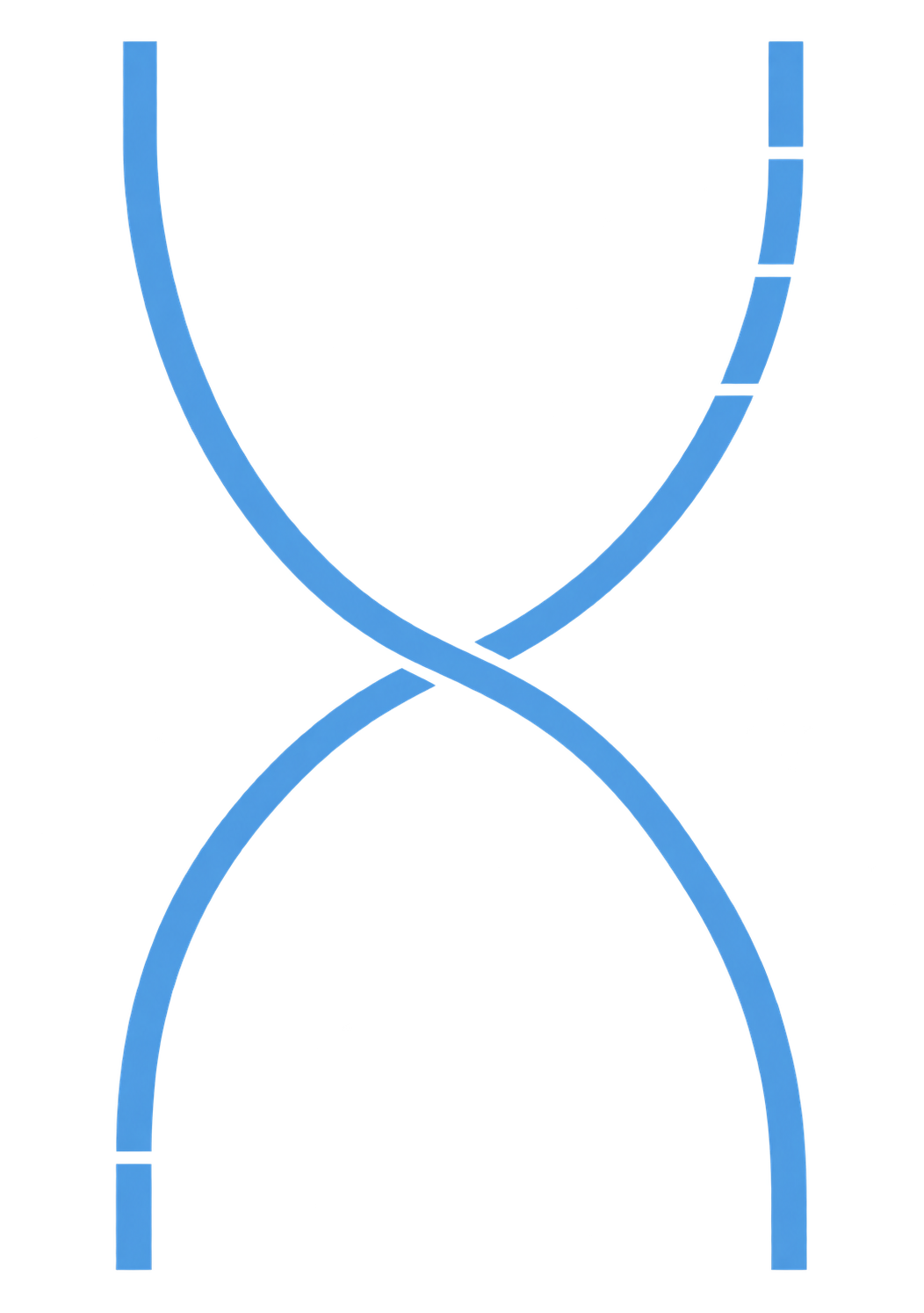
The XSENSIA logo begins with the letter “S”, a thread running through my personal and professional journey. In Portuguese, sensibilidade, saber, simples, singular and solução express sensitivity, knowledge, simplicity, individuality and the search for solutions — different dimensions of how I think and work.
It is also the “S” of Siza, Souto and Simões, names connected to my journey through architecture, design and engineering.
The curve of y = −x³ embodies a stylised “S”. In it, I find a synthesis of my origins and mathematics, which I consistently use to interpret forms, develop projects and turn ideas into reality.
In XSENSIA, this relationship becomes a personal signature. CREATIO carries it forward into a new independent chapter: starting with an equation and exploring what it can make possible.